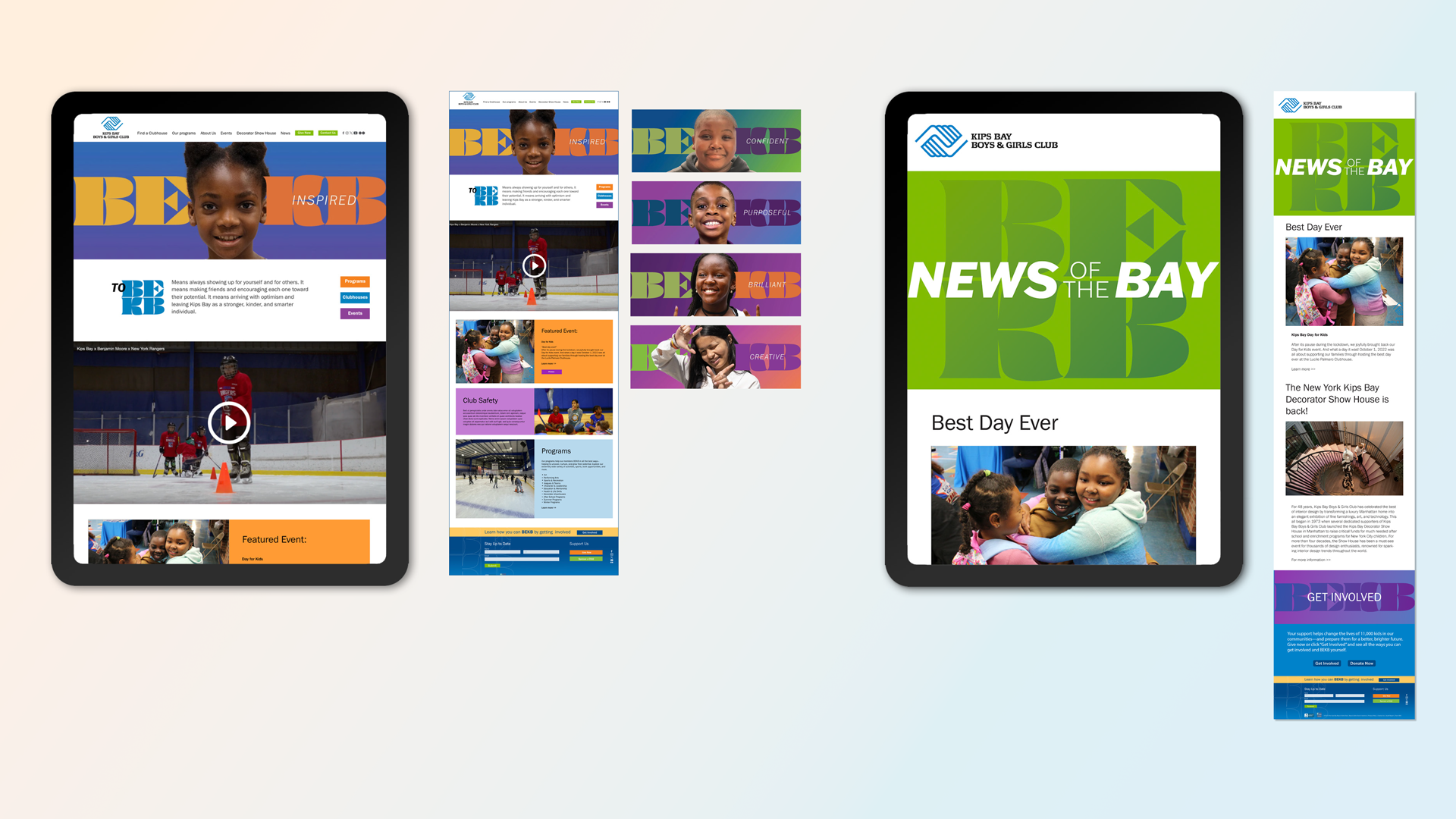
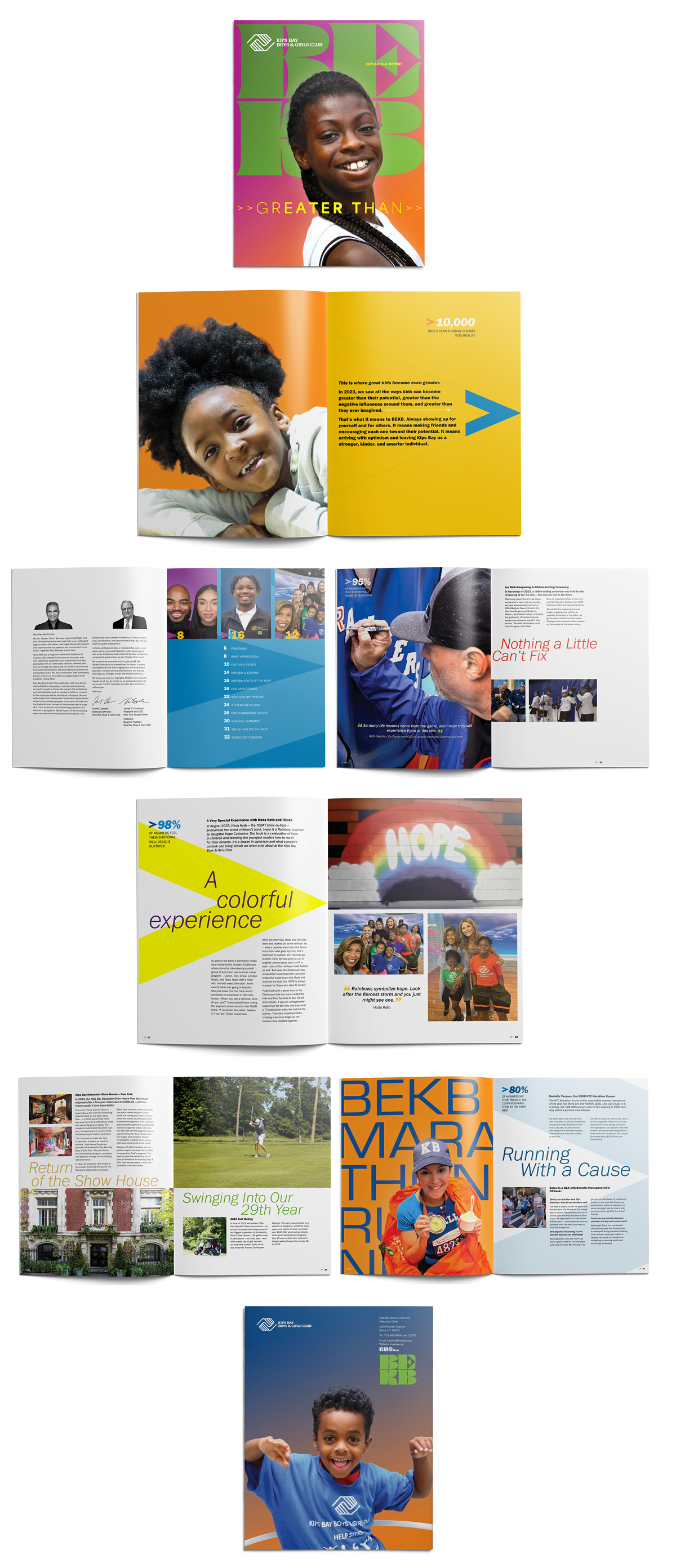
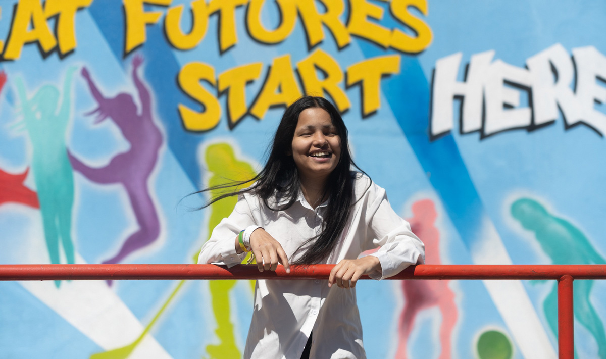
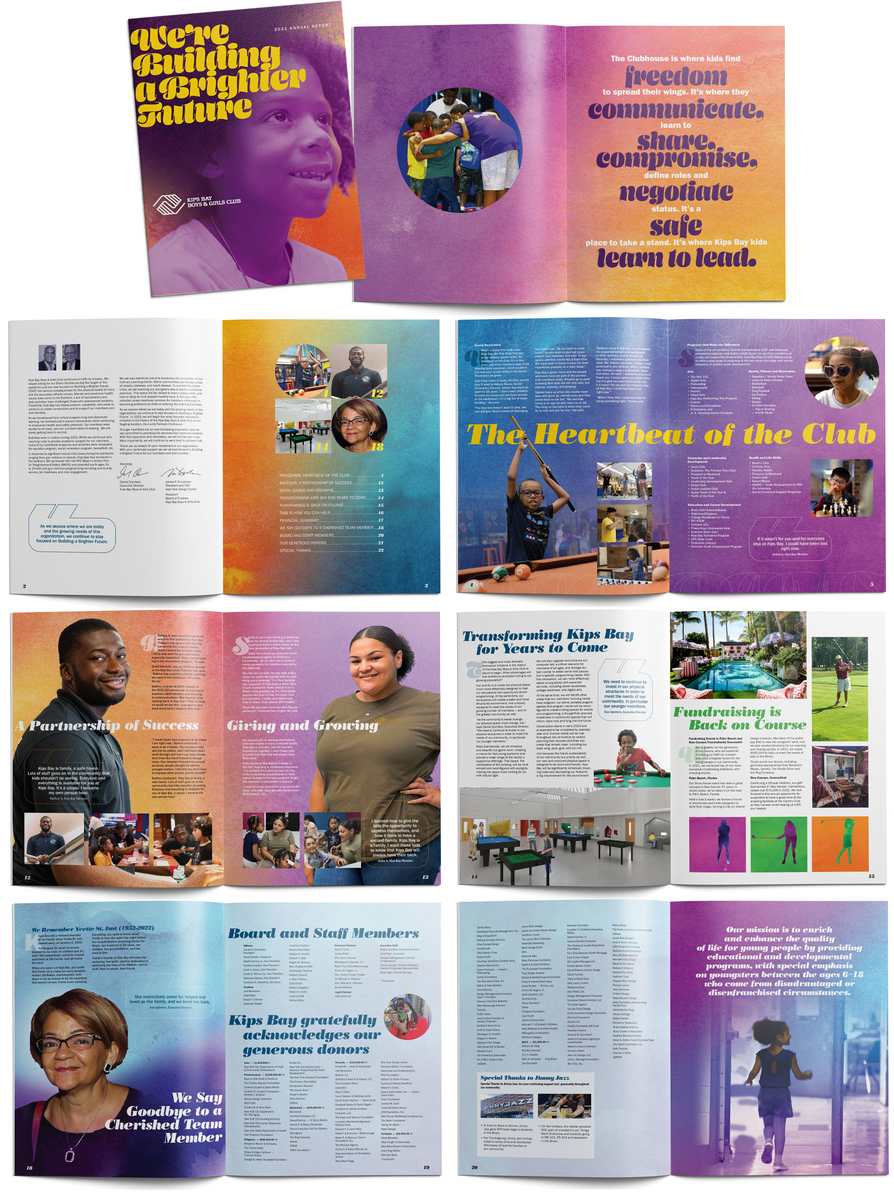
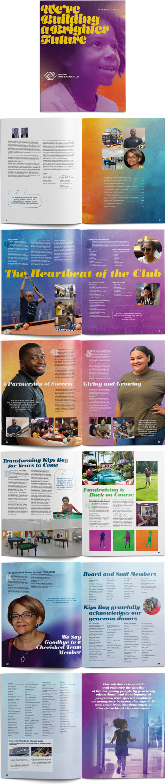
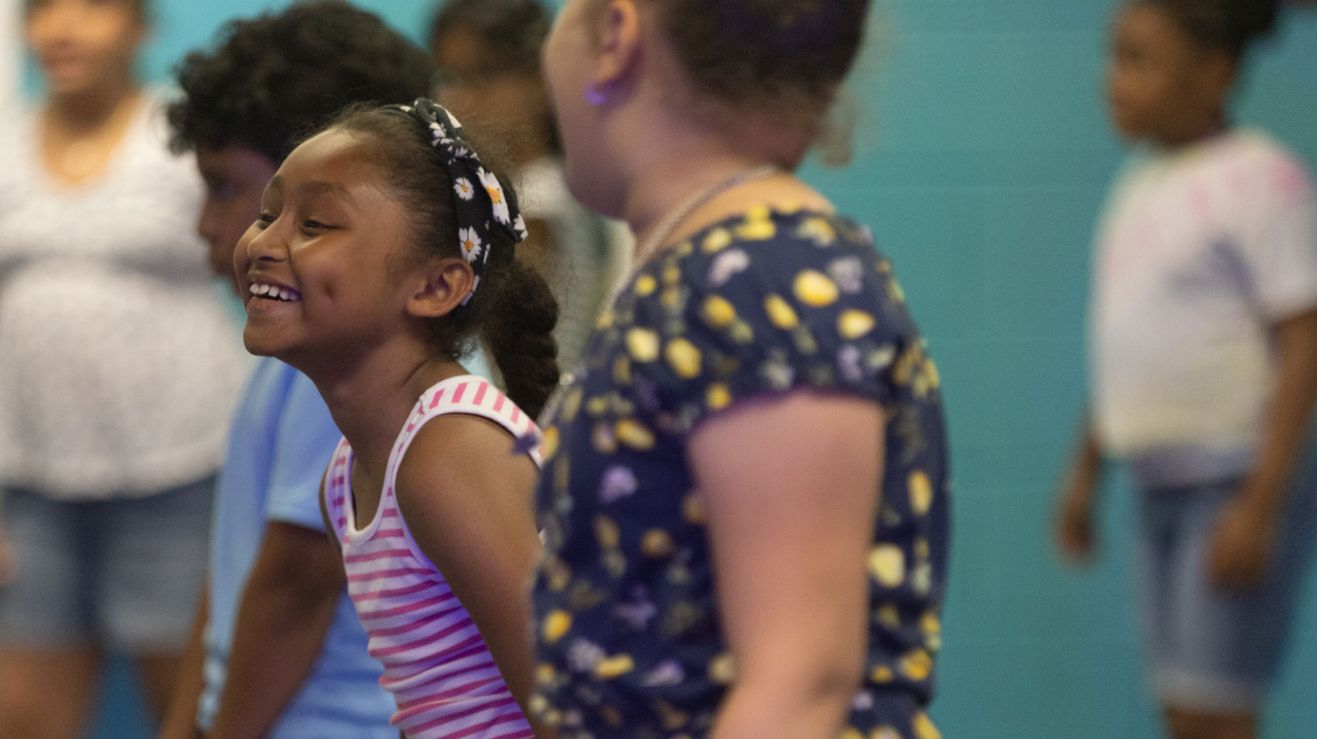
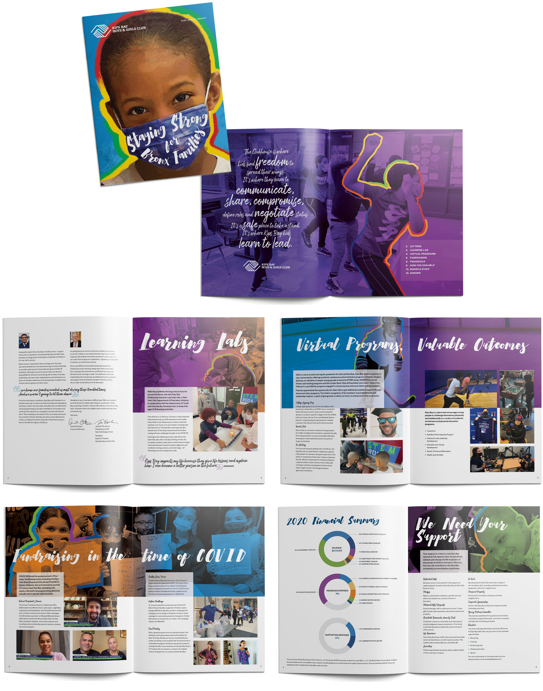
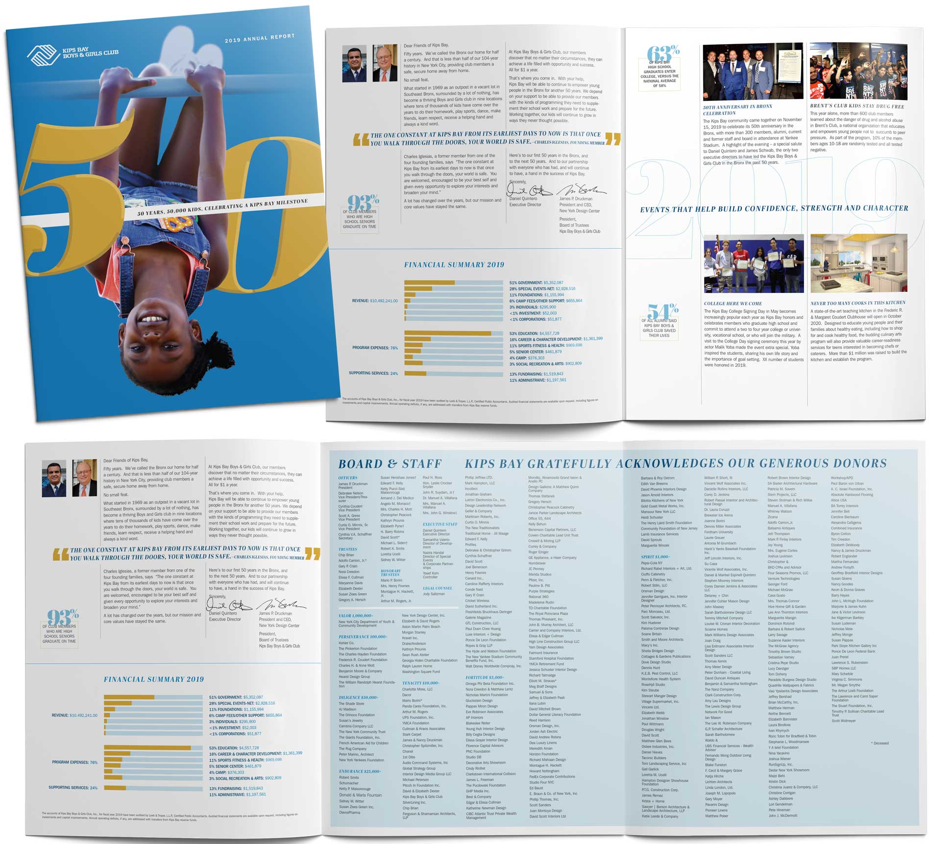
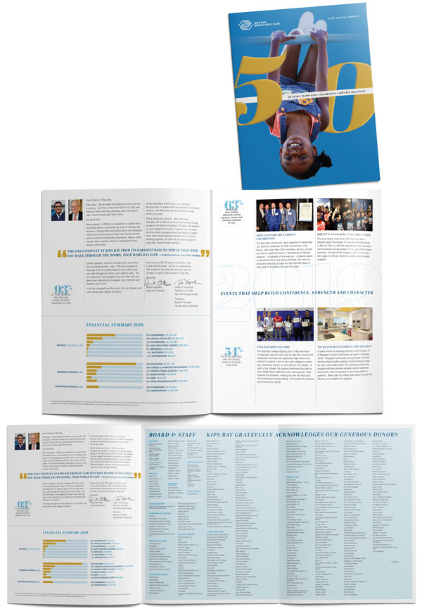
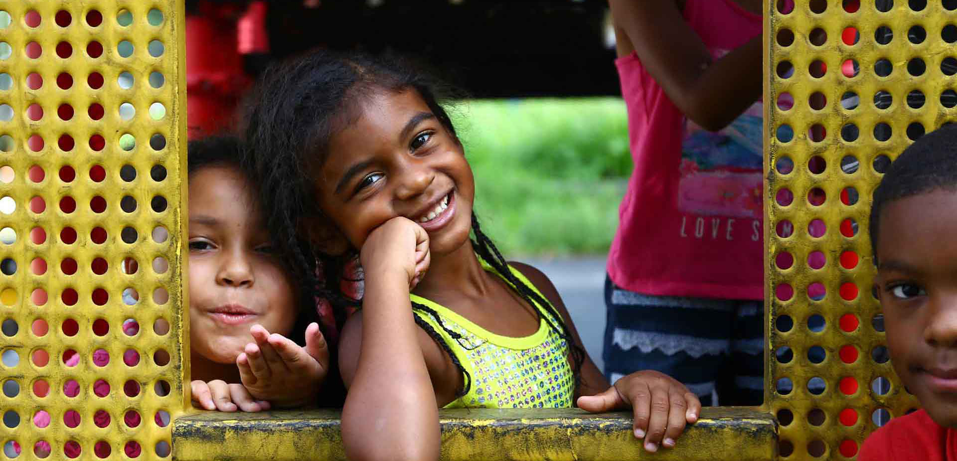
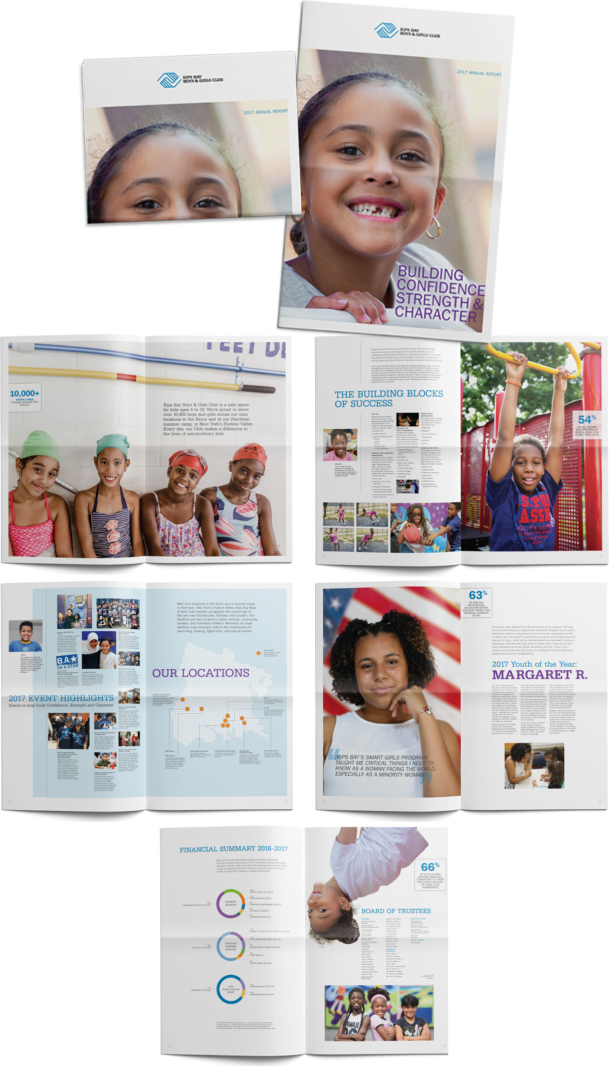
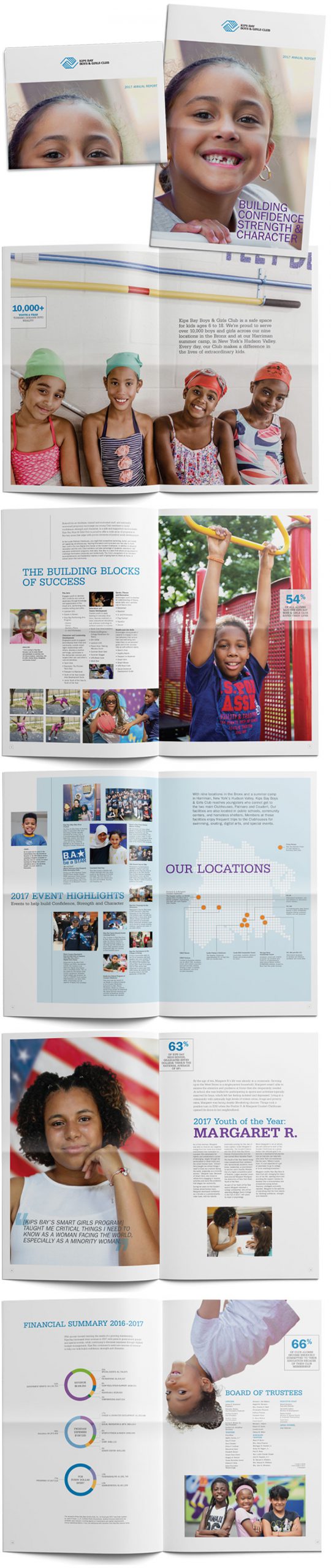
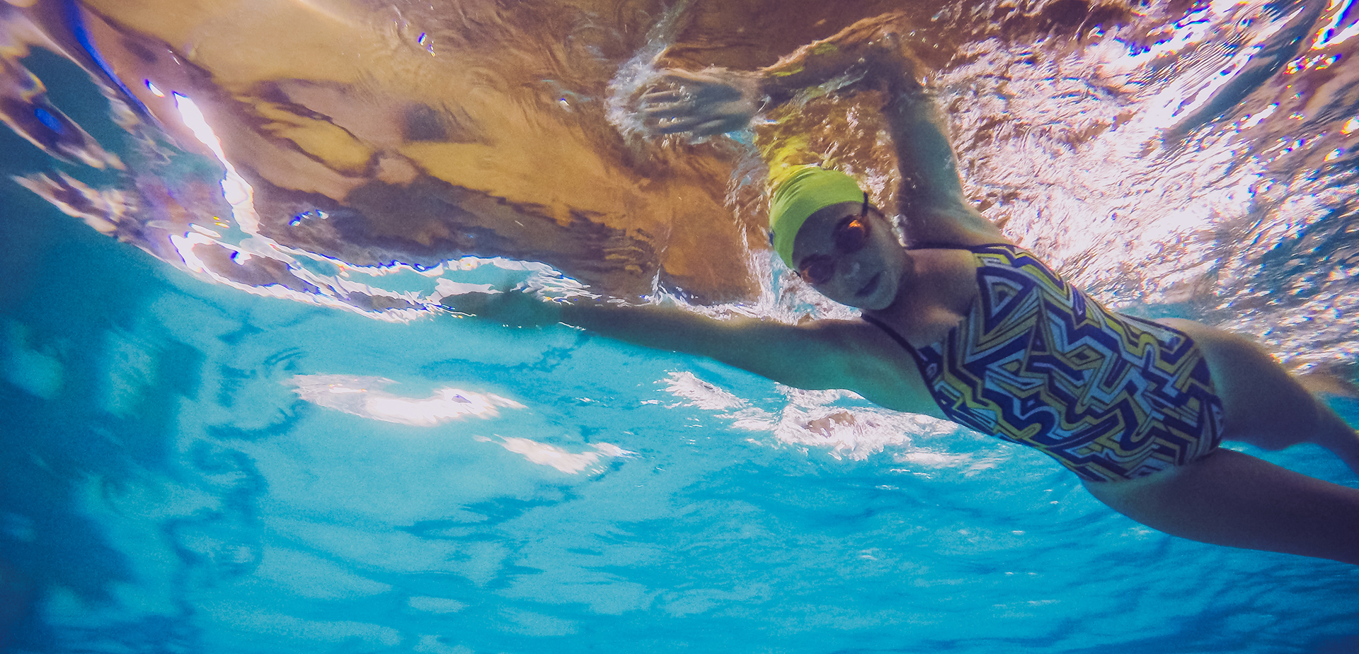
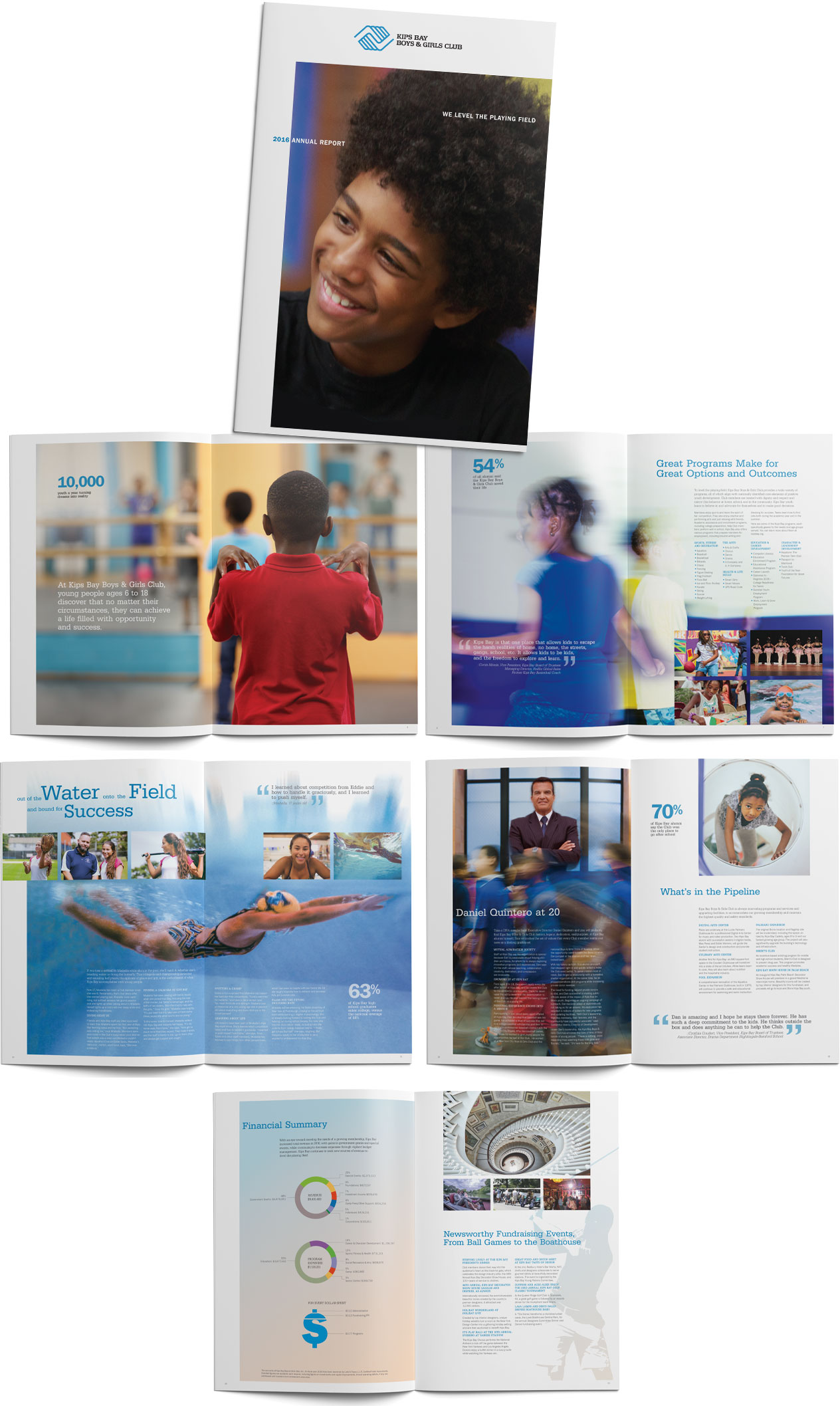
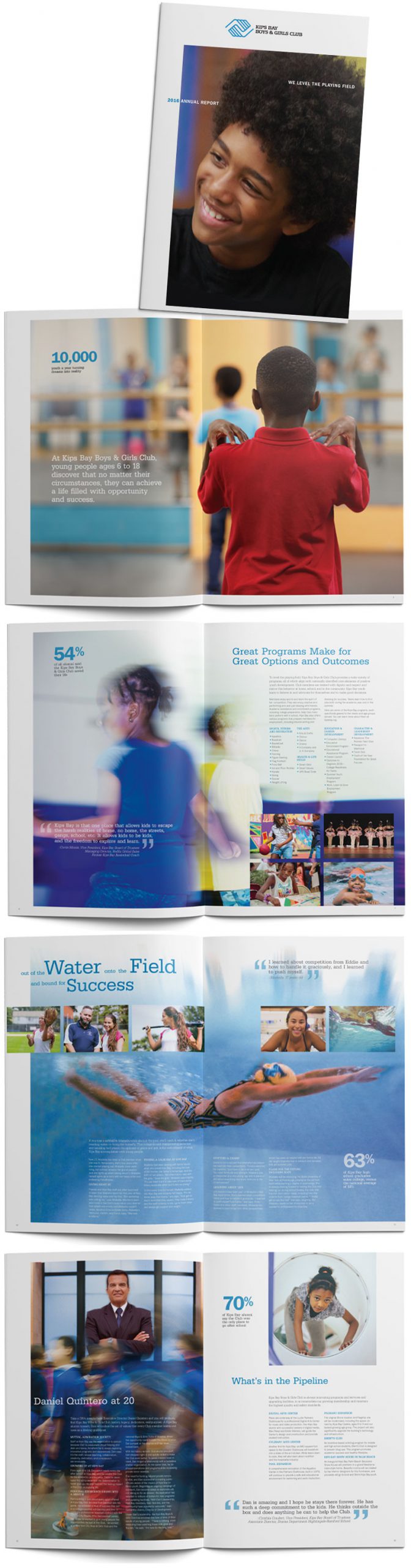
At Kips Bay Boys & Girls Club, kids discover that no matter their circumstances, they can achieve a life with opportunity and success. When Kips Bay needed to refresh their brand image, We designed their annual reports, and produced a development video that features powerful case studies with dynamic imagery and impassioned copy, illustrating how Kips Bay Boys & Girls Club helps level the playing field for over 10,000 underserved kids in the metropolitan area.
Annual report design Story development Copywriting Photography Video production
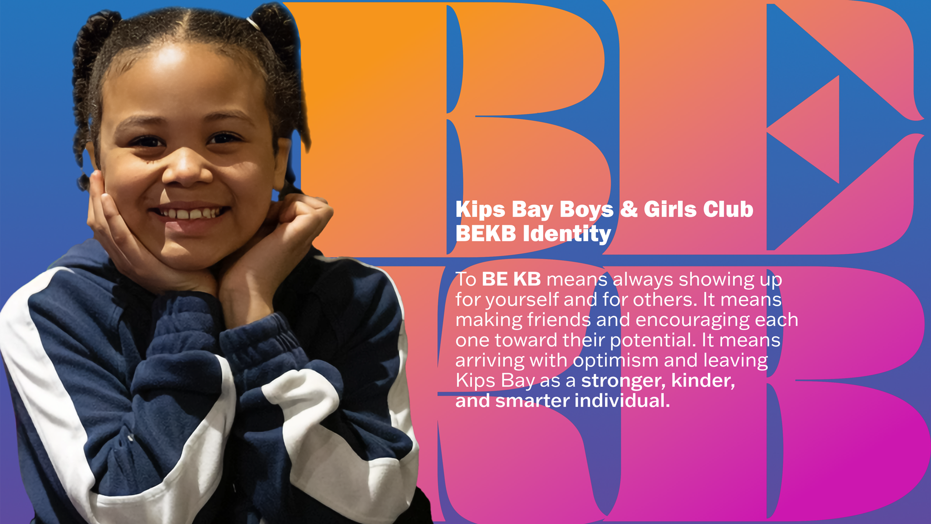
Woodman Creative was tasked to develop a symbol unique to the Kips Bay Boys & Girls club, one of the largest Boys & Girls Clubs in the tristate area, with 11 facilities across the Bronx. The symbol needed to provide an identity that’s distinct from other Boys & Girls Clubs in the area, a visual metaphor for everything it means to be a member of the Kips Bay Boys & Girls Club.
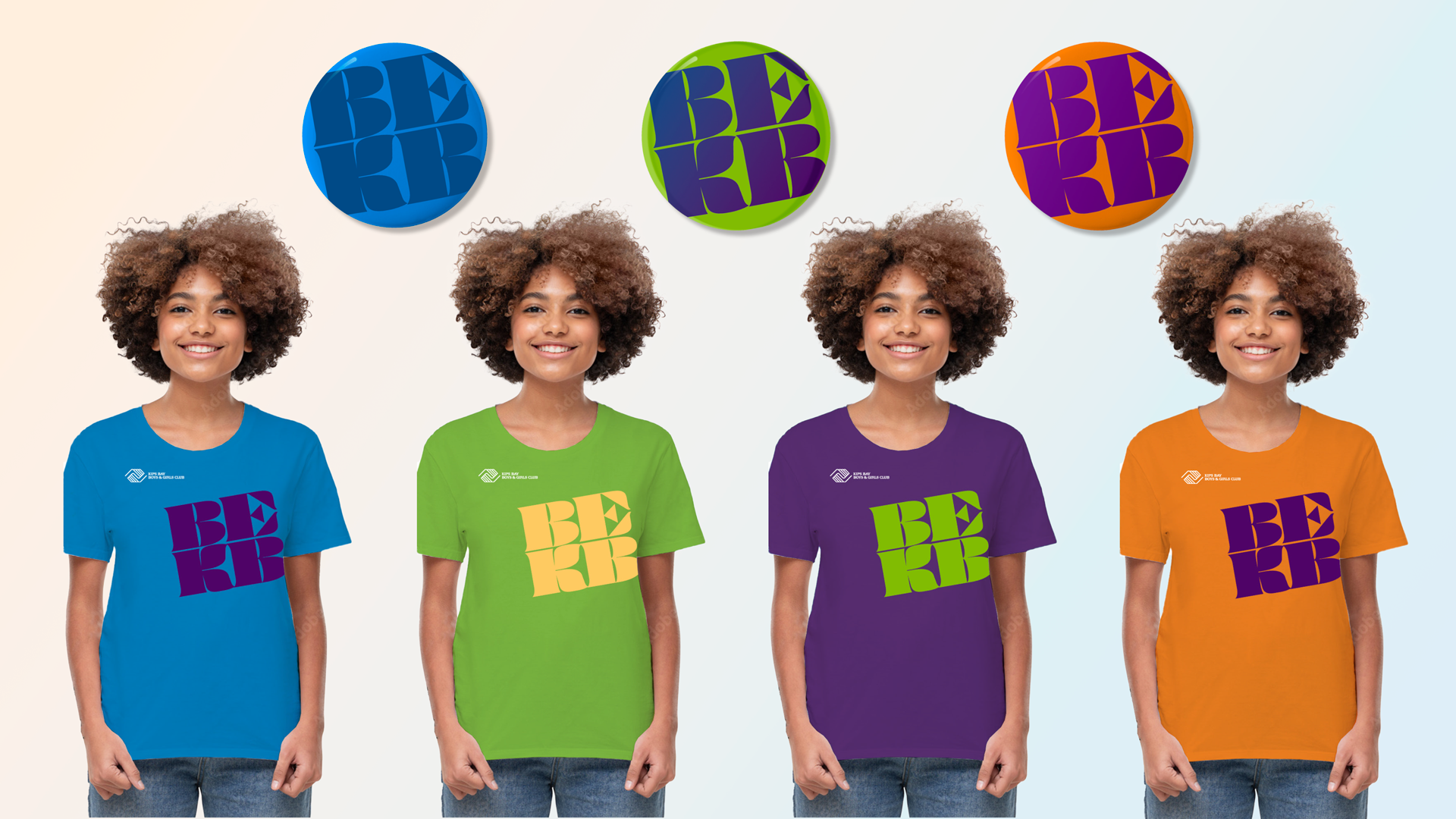
The Kips Bay initials, “KB” became the root of our design. We lifted off the “B” sound as a call to action, and to bring the symbol to life when read and heard aloud, making it both a visual as well as aural signature of the Club.
It’s proven to be everything we aimed for and the client hoped for when approaching the project. “BEKB” became both a statement of unity as well as an invitation. It also celebrates the commitment of the extraordinarily dedicated staff and volunteers.